So that’s how I pay a parking ticket…
We promised to give you more consistent updates from our work on the boston.gov redesign, and today we deliver.
We want to give a glimpse at two new types of content the Digital team is creating: the “article” and the “how-to.”
The less sexy version of the two is the “article,” but it’s still a critical element of the new site. Although a primary focus has been making the site’s copy both shorter to read and easier to understand, some topics will always require a longer explanation. We created the article for these long-form, evergreen pieces of content — basically stuff that’s useful to reference all of the time and doesn’t change often. We have an example live on the pilot site about tips for avoiding parking tickets.
The article page is much more clean and readable than the old site’s design, but we want to be sure you always have someone you can call if you get stuck or need help. No matter how you navigated to an article, you can find the related City department's contact information right up front.
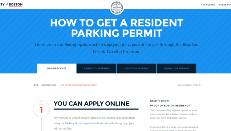
Next, we come to the “how-to.” It’s another way we’re attempting to simplify our content, and it’s a big shift in the way we’ve done things in the past. “How-tos” describe all the ways to complete a task — step-by-step — with the City. We give you all of your options with big tabs at the top, and we put all the relevant information you need on one page. We don’t want you to have to hunt around through multiple urls just to get something done the right way.
You can see versions of these how-tos in our Having a Car in the City topic on the pilot site. The how-to on paying a parking ticket gives you all your options for paying the fine. We also have a how-to on the City’s resident parking permit program, with the different options you have to apply for and manage your permit.
To illustrate just how big of a shift we’re talking about with the how-to, we essentially replaced this, this,this, this, this, and this about the resident parking program, with this:
In both of these new types of content, we’re putting an emphasis on plain language, and giving you information without you needing to break out a dictionary. It’s something we’ve mentioned before, and something we always keep in mind when creating digital tools for residents.
These new page types also won’t be limited to the text you see. Thanks to the modularity of Drupal, we can add information from other parts of the site, and stack these pages with relevant material for residents.
The new content we’re showing you today is just a snapshot of the work we’ve been doing behind the scenes. We’ll also be updating the navigation on the the pilot site soon to help you find the content we’re creating. Next up, we’ll show you how we’re featuring elected officials on the new site. As always, let us know what you think about the site, and how we can make it better.


